
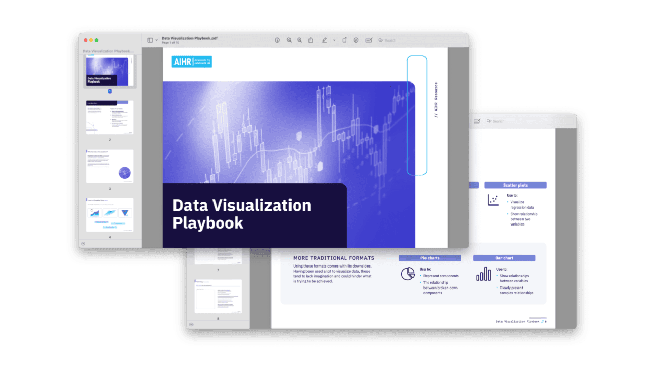

This guide introduces HR professionals to the fundamentals of data visualization and how to communicate data insights clearly to different audiences. It supports practical planning, visual format selection, and accessibility considerations for presenting HR data effectively.
Included in this resource:
- Explanation of what data visualization is and why it matters in HR analytics
- Three-part “How to visualize data” section with an activity, visual examples, and traditional visualization formats
- Planning prompts covering what message to communicate, who the audience is, and how the data will be visualized
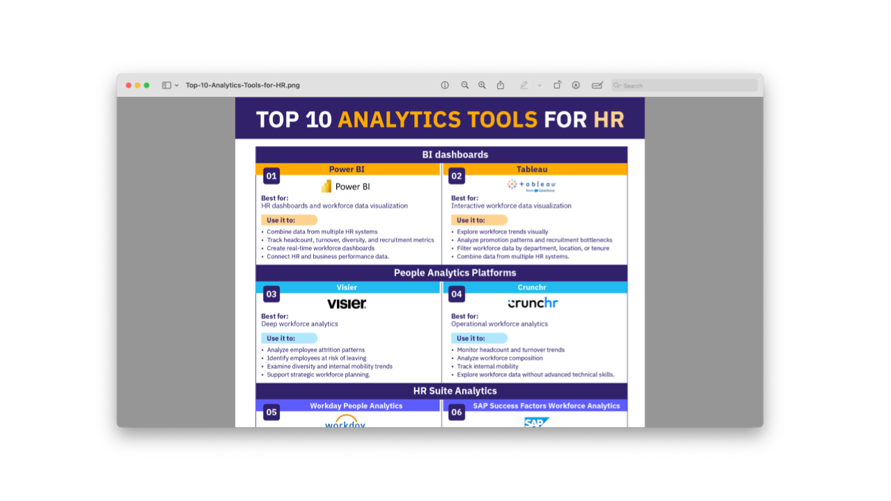
- Overview of data visualization tools, including Microsoft Excel, Microsoft Power BI, Datawrapper, and Tableau Platform
- Accessibility considerations for color, text, labels, textures, and white space